

[ 04/09 ] Professional experience
Platform Redesign — TradeTracker
200k publishers, 5k merchants, and most user tasks routed through account managers. The team debated a cosmetic refresh. I joined as the sole designer and pushed for a full redesign instead.
Role
Design Lead
Year
2025
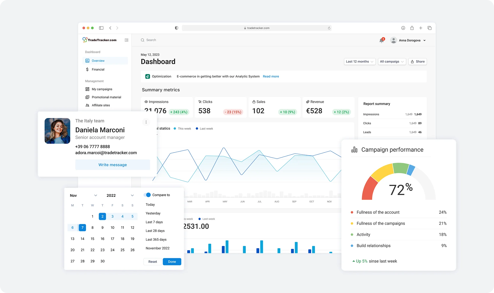
Design Lead, team of 3. I redesigned a global B2B affiliate platform: 200k+ publishers, 5k+ merchants, 50+ pages. I ran research through the account and sales managers who talk to clients daily, set the new architecture, and rolled it out in phases so existing users weren't thrown off.
Result: developer clarification requests down 50%, feature delivery 2.5× faster.
Background
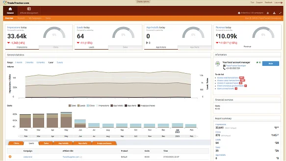
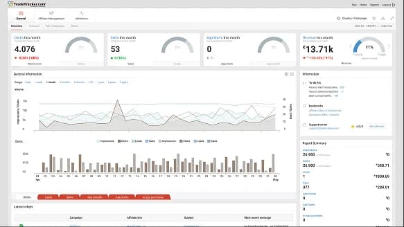
The platform looked like it needed a cosmetic refresh. But the UI issues were symptoms, not the disease. The real problems were structural: desktop-only, dense interfaces with steep learning curves, no direct merchant control, and visually outdated.
I couldn't interview end users directly — affiliate marketing is a closed world, and access was limited. So I ran research through the people on the phone with clients every day: account and sales managers. The pain points came back consistent across every stakeholder: usability, transparency, complexity.
Contribution
Product design, UX research, Design direction, B2B SaaS
Duration
Ongoing
Usability
Dense interfaces with steep learning curves meant most tasks required a trained account manager to step in — slow and expensive on the operations side.
Transparency
Merchants had no direct control over their own campaigns, which killed trust. Sales managers were doing work the product should have been doing.
Complexity
The platform was desktop-only with workflows that made no sense without human explanation.
Visual identity
The platform looked a decade old, which made acquisition harder than it needed to be.
From sole designer to Design Lead
I joined as the sole designer. I ran a design audit, did stakeholder interviews, and mapped problems and user journeys. Once research wrapped, I set the visual direction and the new architecture.
Three more designers joined later, and I moved into Design Lead. The redesign ran in two parallel streams — publisher and merchant. This case covers the merchant side.
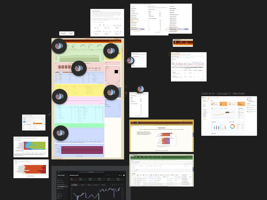
A phased rollout instead of a hard cutover
The team wanted to ship the new platform in one go. I pushed back.
We weren't just changing visual style — we were rebuilding the architecture and reworking core flows. A hard cutover would tank retention. So I proposed three stages.
Neutral palette update on the existing platform
Calmer, more modern, no workflow changes.
Ship new features piece by piece over months
All aligned with the upcoming UX direction, so users adapted incrementally.
Full redesigned platform
About a year in. By then users had already lived through most of the changes.
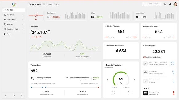
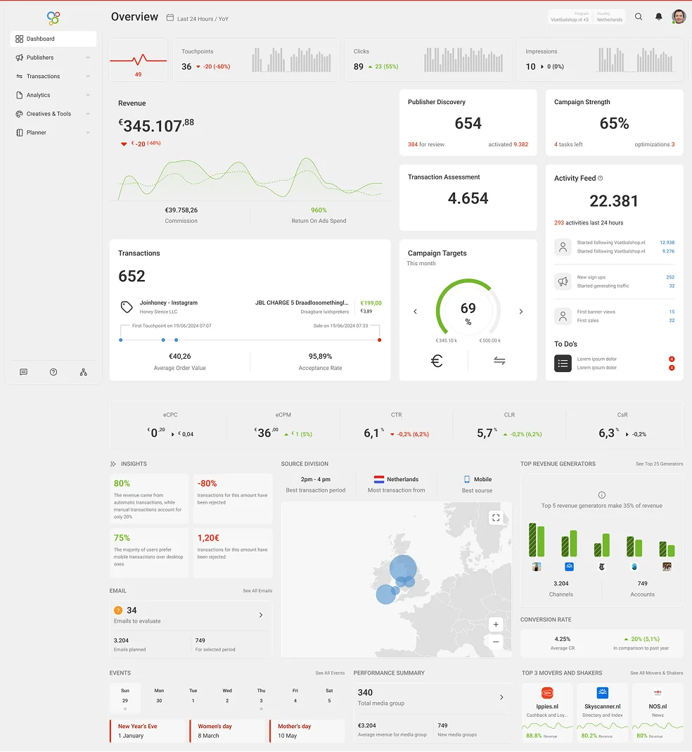
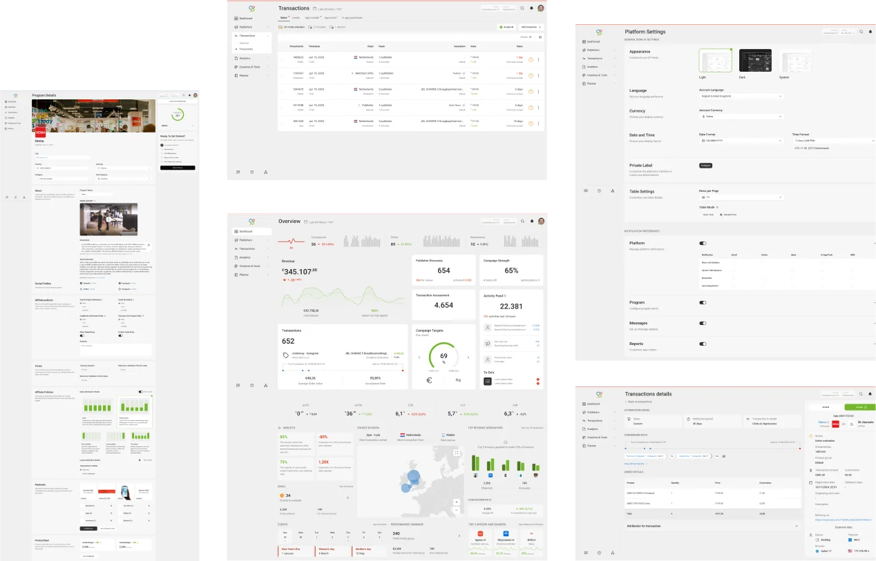
01 — Compact layout
Critical information fits on the first screen. No scrolling for what should be obvious.
02 — Visual hierarchy
Key data points pull forward. Everything else recedes.
03 — Reduced cognitive load
Secondary details get tucked away — accessible, not dominant.
04 — Airy interface
Fewer elements doing more work. Easier to read, easier to navigate.
Before
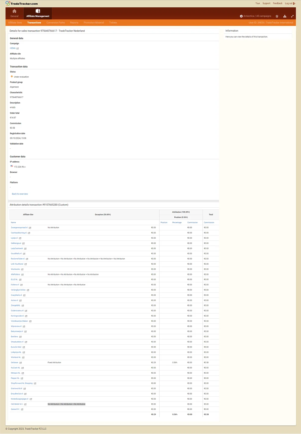
After
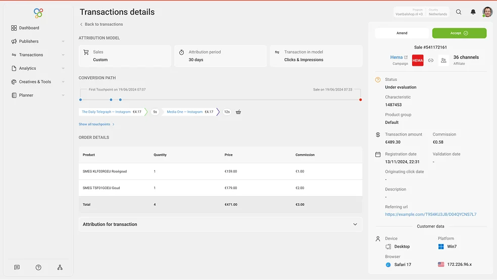
Before
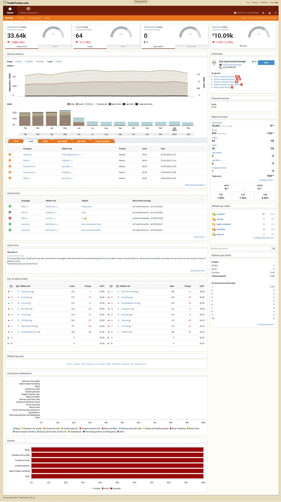
After
Measured
50%
Fewer developer clarification requests
Clearer specs and a shared Figma UI kit cut the back-and-forth with engineering during build.
2.5×
Faster feature delivery
Reusable components and defined patterns let the team ship features faster than the old platform allowed.
Projected — rollout still in progress
40%
Drop in support inquiries
Easier registration, self-service campaign tools, and AI search knowledge base did most of the lifting.
20–30%
Cut in operational costs
Tied to manager staffing. Fewer support and account manager inquiries meant leaner ops.
3–5x
Retention of inactive users
Refreshed UI and simpler workflows brought previously inactive users back.
20%
Lift in client acquisition
A modern product is easier to sell.
Thanks for looking at my case study!
I have plenty more details and insights to share. Let's hop on a call to discuss it further. You can also learn more about my experience or check out my other work.
Back
 All cases
Next case
Design system — Webshop