[ 03/09 ] Professional experience
Redesign — DreamBiz
One month. Four platforms. Zero previous designers. I rebuilt the entire product — from broken flows to something developers could build from and partners could demo.
Role
Founder Product Designer
Year
2026
When I joined, the product had been designed by the PM and built by engineering wherever screens were missing. The result: patterns without a system, screens without flows. My job was to get it to a state where the business could demo it, developers could build from it, and users could actually finish something.
Four surfaces. One month. After the first partner demo, no one asked whether this was a prototype.
Contribution
Product design, Design system, UX audit, Motion
Duration
1 month
4
Platforms redesigned in one month
Project, Pitch Deck, Chat, and Mobile — all redesigned with a unified design system underneath.
~30%
Improved main flow completion rate
Users who previously dropped off at the empty chat now completed their first project or pitch deck.
↓
Fewer dev questions and QA regressions
A proper design system and annotated specs meant developers built it right the first time. Less back-and-forth after QA review.
Overview
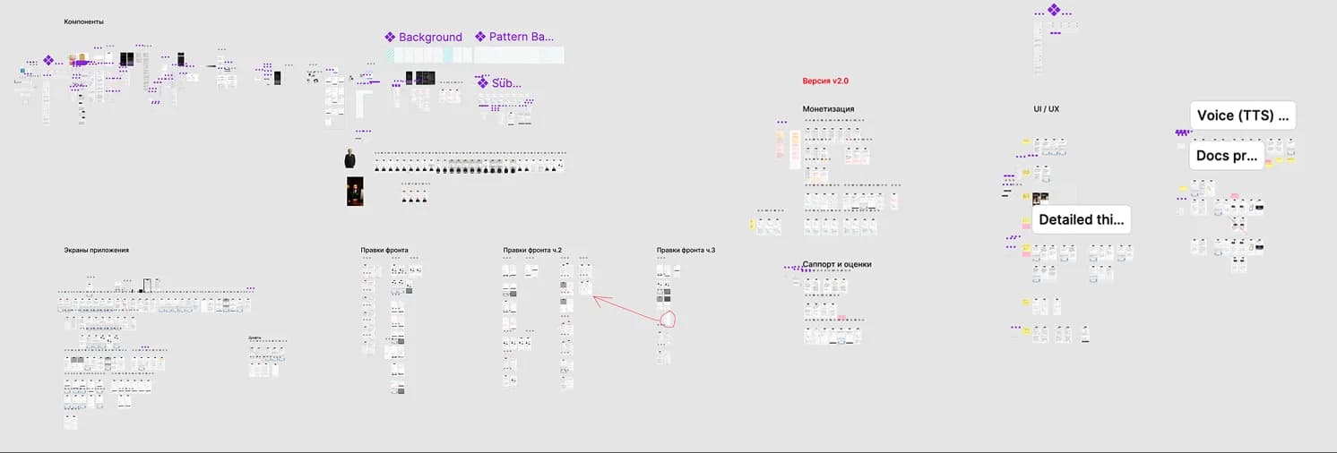
DreamBiz had no shared component library. Each developer and each screen used independently built components — unlinked in Figma, drifting in production. There was no way to change one thing and have it propagate.
Every component in Figma was detached — duplicated and modified independently. Changing a button meant finding every button. The file had no structure: pages, frames, and layers were mixed without logic.
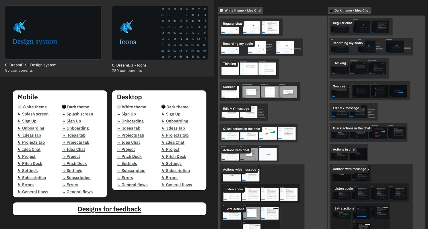
Built a component library from scratch: master components with auto-layout, semantic naming, and design tokens. File restructured by surface with a dedicated system page. One change now propagates everywhere.
Before
After
Overview
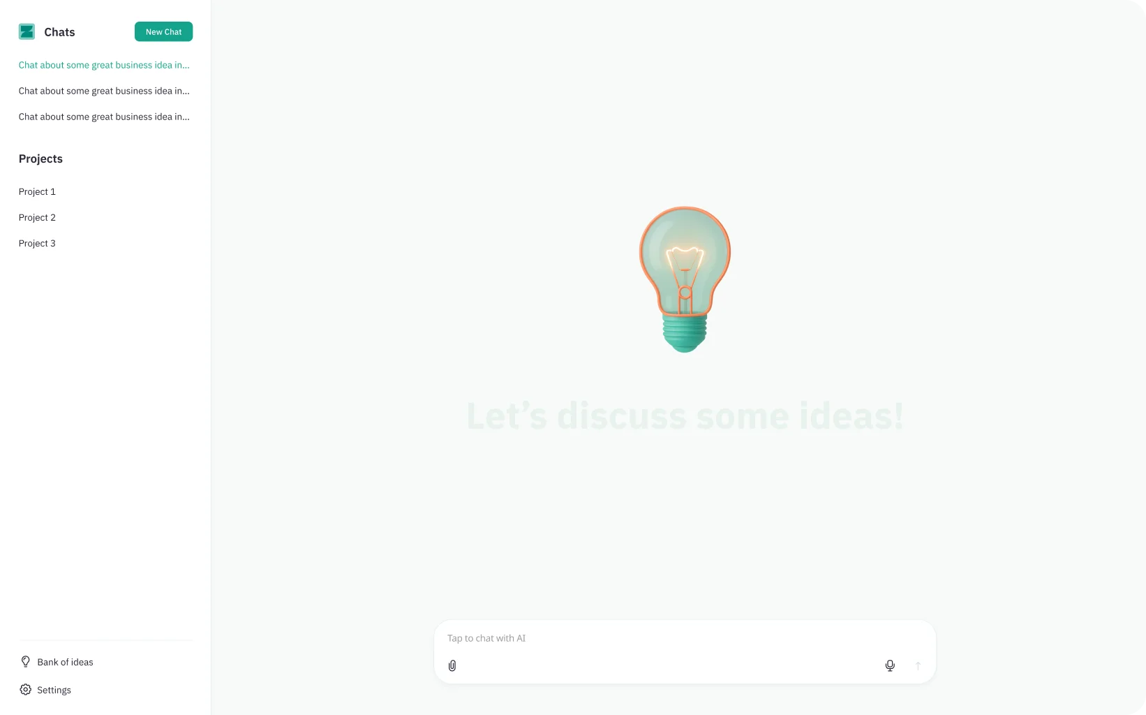
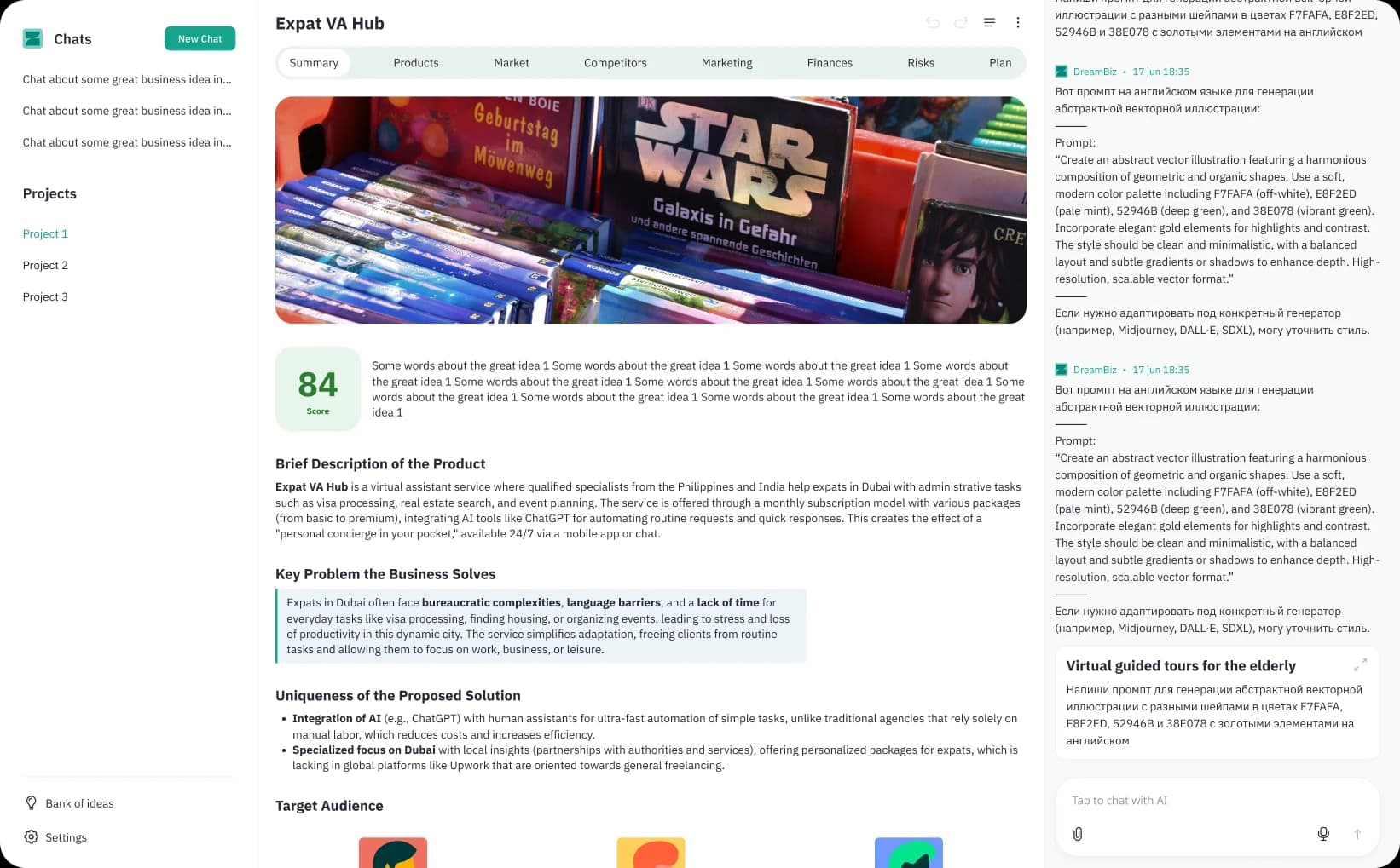
The platform's core value is creating projects and pitch decks through a chat. But when a new user lands, the chat is empty — and there was nothing guiding them toward the first action.
Problem and insight
There was no bridge between an empty chat and the product's core value.
The product could generate complete projects and pitch decks from a single prompt — but new users faced a blank input with no examples, no guidance, and no entry point. The path from arrival to first creation didn't exist visually.
The empty chat was a blank input box. No example prompts, no context, no visual indication that this was the place to start a project or pitch deck. Users typed nothing — or typed once and left.
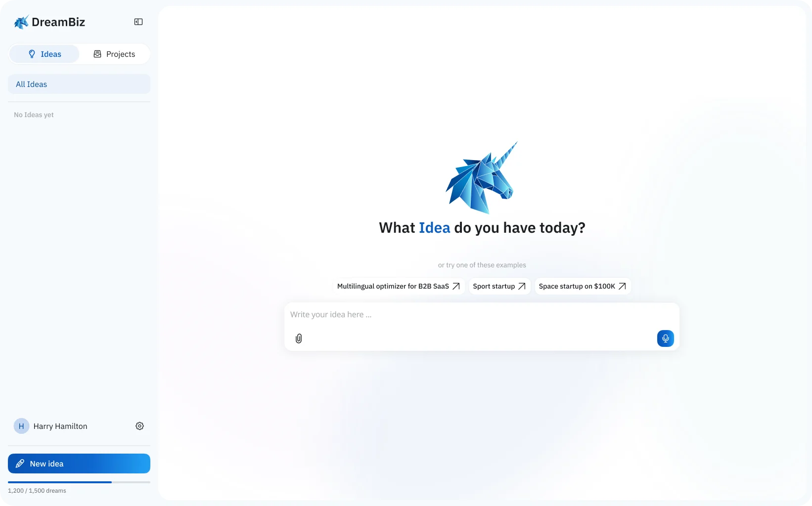
Designed a contextual empty state: example prompts tailored to the platform, clear entry points to start a project or pitch deck, and visual cues that reduced blank-page friction.
Before
After
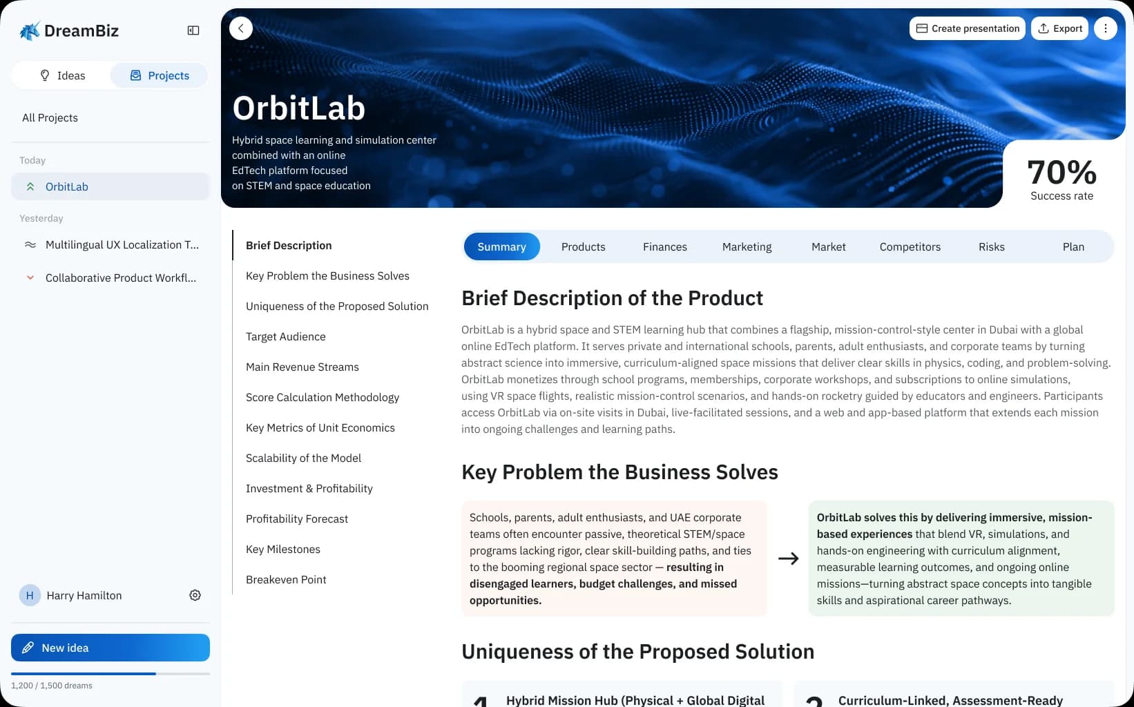
Overview
The most visually inconsistent surface. Built section by section by engineering without design input — each block had its own visual logic, typeface choices, and spacing. No shared typographic scale, no spatial rhythm, no brand identity.
Different styles per section: some used cards, others raw lists. Typography was inconsistent across similar elements. Spacing was arbitrary. It looked like four designers had each built one part independently.
Applied a unified design language across all project sections — single typographic scale, one spacing system, consistent card and section patterns. The page now reads as one coherent surface.
Before
After
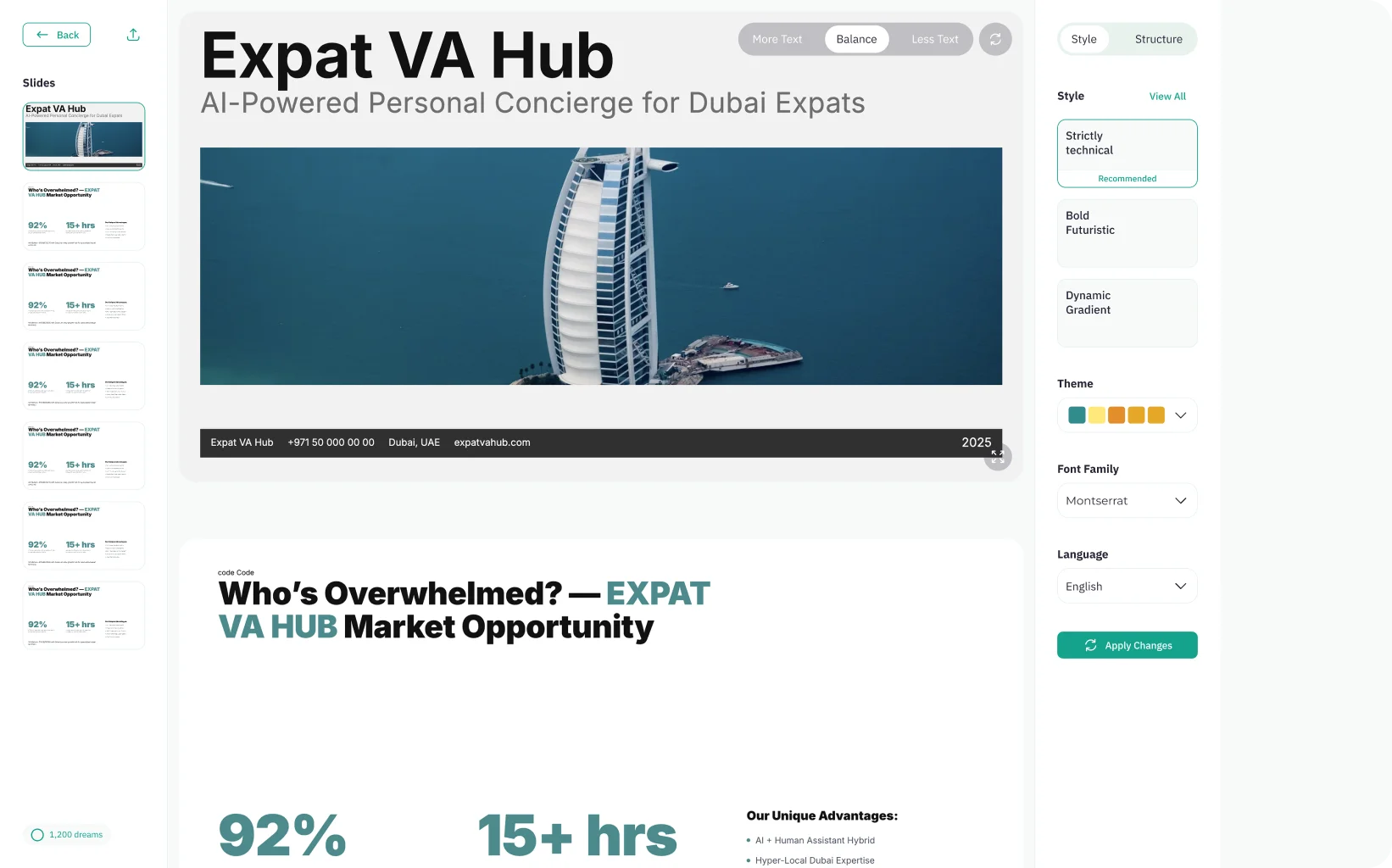
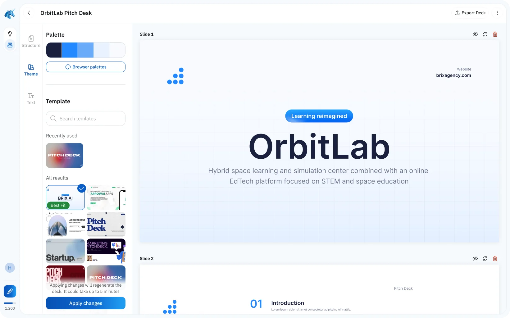
Overview
The pitch deck editor was the surface partners would see first in a demo. It needed to read as a real product — polished enough that no one would ask “is this a prototype?”
Slides varied in layout logic. No templates, no consistent structure. The output didn't match the quality expected in a partner demo — it still looked like an engineering draft.
Redesigned the slide editor with consistent layout templates, a defined grid, and a refined output view. Partners could be demoed the full pitch deck flow without caveats or qualifications.
Before
After
Thanks for looking at my case study!
I have plenty more details and insights to share. Let's hop on a call to discuss it further. You can also learn more about my experience or check out my other work.
Back
Next case
Platform Redesign — TradeTracker