

[ 05/09 ] Professional experience
Design system
Solo designer on a fragmented product. Five-week release cycles, no shared components, Figma files nobody could navigate. Nobody asked me to build a design system — I proposed it. The MVP shipped in a month.
Role
Solo Designer
Year
2023–2025
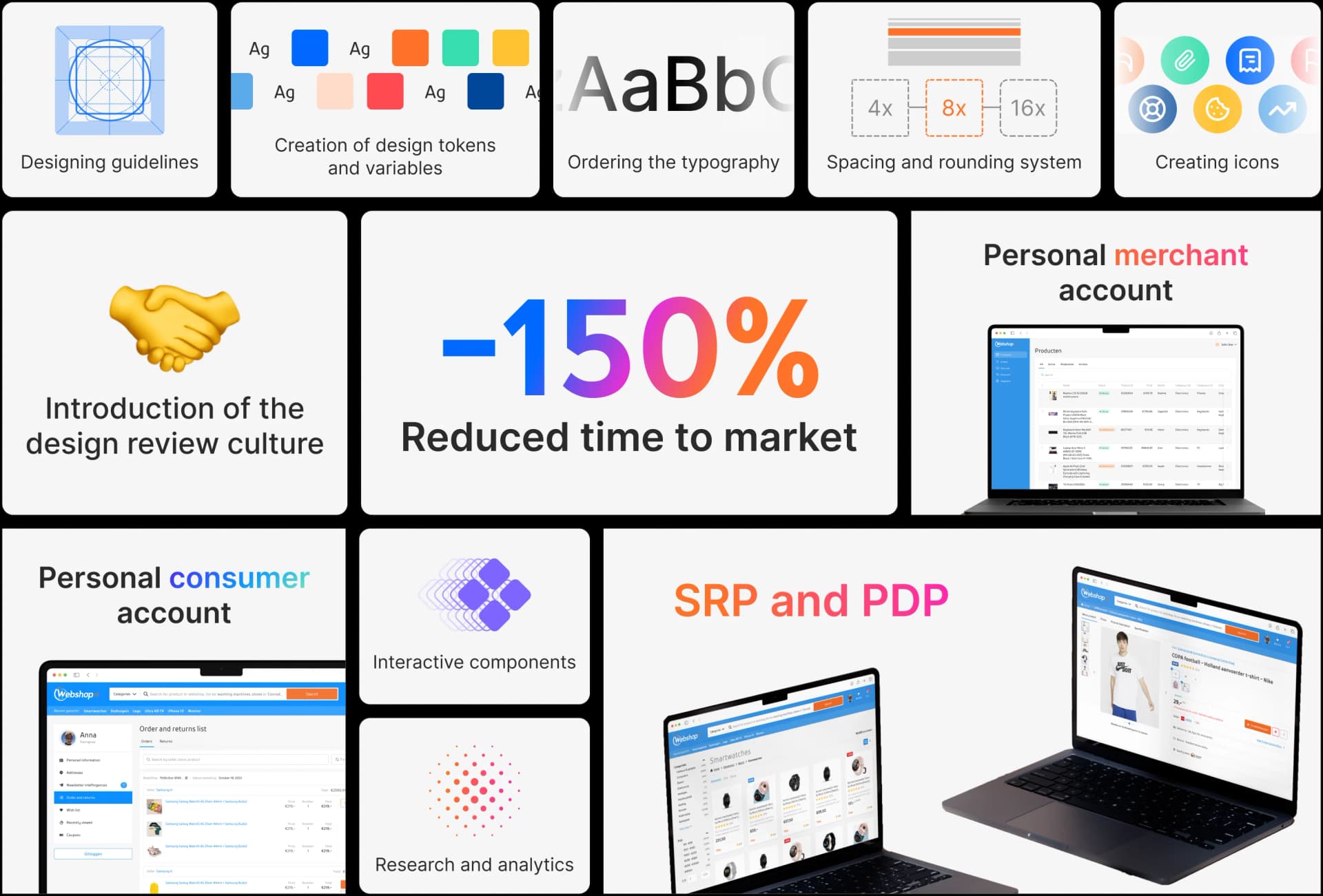
Why I Proposed a Design System
User Core Frustrations
Feature releases averaged 5 weeks slowing product growth
Lack of shared design components caused fragmented
Designers and developers lacked a unified language and workflow
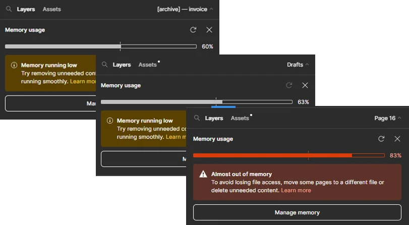
Figma files were fragmented, slow to access, and confusing
Onboarding new team members was inefficient and slow
Designers were uncertain about which designs were final
To address these, I proposed building a design system to unify elements, streamline collaboration, and speed up development.
The Process: Leading the Project
With the problems clear, I started building a design system that fit how Webshop actually worked. The product was fragmented, so the system had to be small and practical — something the team would adopt right away, not a library nobody opens.
I kept the process loose enough to adjust as I learned. The goal was a working toolkit the team would actually use day to day, not a style guide that sits untouched.
01
Assessing the current design landscape
I reviewed existing designs and Figma files to understand inconsistencies, redundancies, and workflow blockers
02
Engaging with stakeholders
I conducted interviews and surveys with designers and developers to pinpoint pain points and feature priorities
03
Creating reusable tokens and components
I developed a library of UI elements design tokens (colors, typography, spacing) and components (buttons, badges, grids) tailored to Webshop's brand and technical constraints
04
Building collaboration workflows
I introduced clearer channels and documentation for design handoff, version control, and file management to reduce confusion and errors.
05
Iterating rapidly with feedback
Regular check-ins and demos helped the team stay involved, allowing me to adapt the system based on real needs and constraints.
Solutions: Building a Pragmatic, Lightweight Design System
Reusable Components and Design Tokens
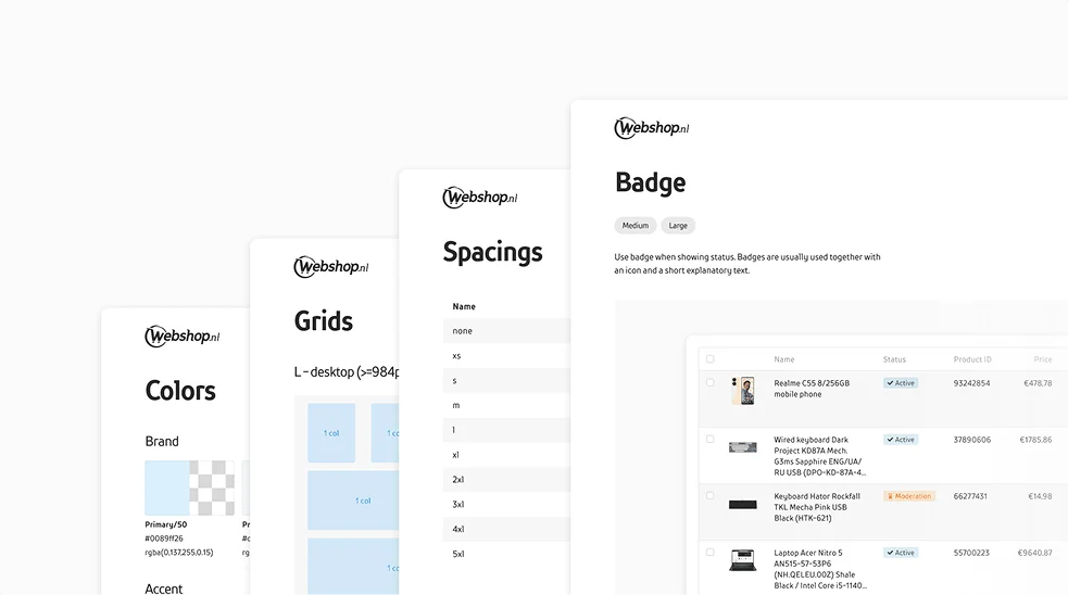
I built a library of consistent UI components: buttons, badges, grids, input field, etc. And standardized design tokens for colors, typography, and spacing.
Outcome
Designers and developers finally worked from one source of truth. Collaboration got easier and new people ramped up faster.
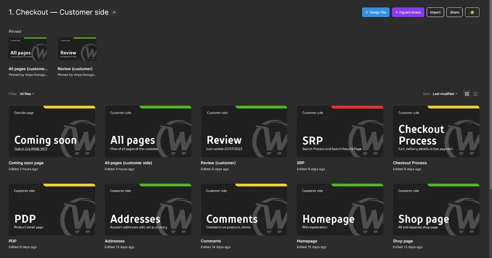
Improved File Structure
Reorganized Figma files for easier navigation and faster load times by grouping related assets and screens logically.
Outcome
Less daily friction for the design team, faster file loads, a lot less time lost hunting for the right file.
Full Flow Audit and Coverage
Mapped complete user journeys covering all customer-facing screens to identify and fill gaps like missing states or screens.
Outcome
The audit caught gaps before they shipped. The product felt more complete, and stakeholders trusted what they were seeing.
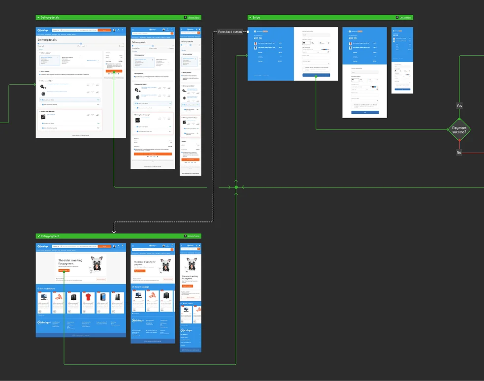
Together these changes made Webshop more consistent, easier to build on, and quicker to ship.
5w → 2–3w
Release cycle
Reduced
Onboarding time
100%
Team adoption
Thanks for looking at my case study!
I have plenty more details and insights to share. Let's hop on a call to discuss it further. You can also learn more about my experience or check out my other work.
Back
 All cases
Next case
Telegram Mini-Apps